Overview
Trends are a type of Insight that allow you to plot data from people, events, and properties. Trends are an incredibly powerful part of PostHog's analytics toolbox, and are useful for finding patterns in your data, as well as monitoring your product to ensure everything is running smoothly.
What can you learn from trends?
- Track how your metrics are changing over time.
- Compare the usage of different features side-by-side.
- Determine how a specific change affects usage or engagement with your product.
- Identify long-term patterns or cycles in your usage.
- Easily create cohorts of users based on when they performed events.
- Analyze how the properties of events vary over time using aggregation (sum, average, etc).
Getting Started
Creating a new trend
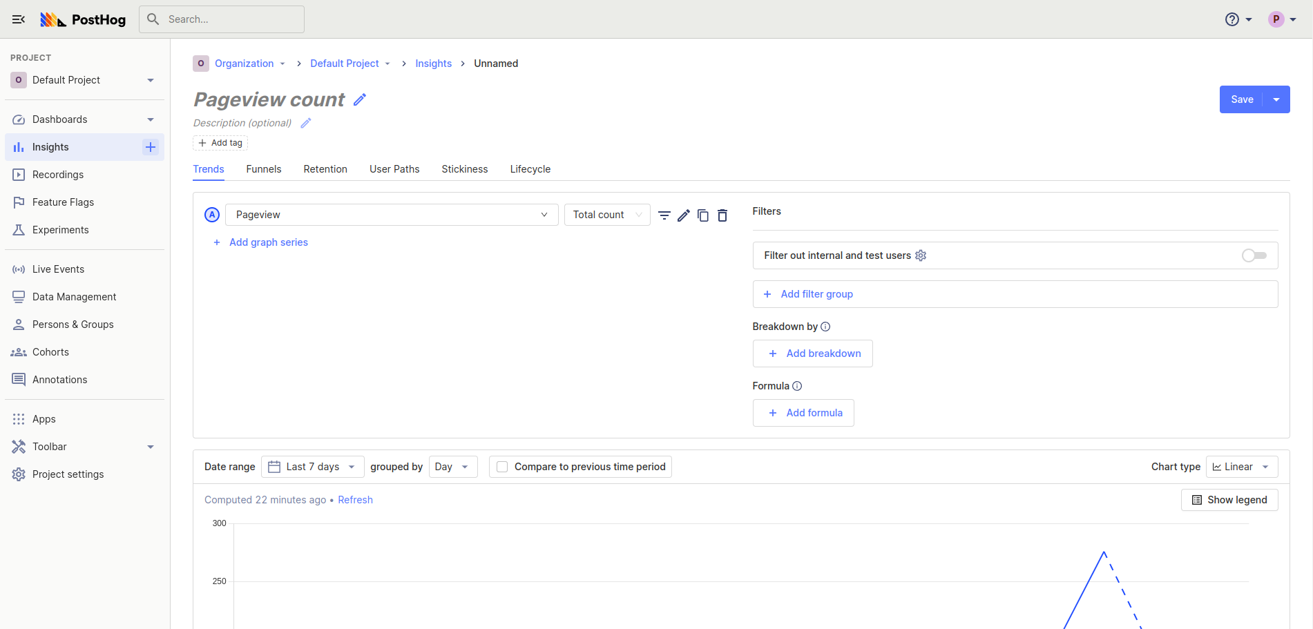
Using the side menu, navigate to the Insights tab where you'll be able to see a list of all your saved insights. You can then create a new Insight by clicking on the New insight button in the top right. By default, new insights will default to Trends.
You should now see a screen that looks like this
Adding events
Now that we've created our Trends insight, the next thing we want to do is select the events we would like to see. This can be done by clicking the dropdown to the right of the
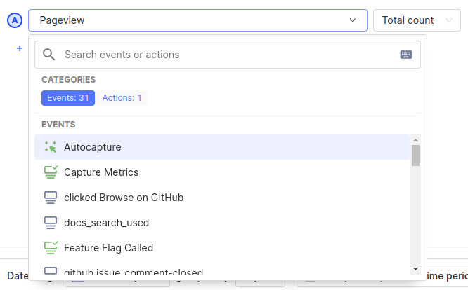
This dropdown allows you to search through all your events and actions and pick which one you would like to plot data from.
By default, the total number of events (Total count) that occurred within a specific date range will be shown. If you'd like to see other metrics, such as 'Unique users' or 'DAU', check out the event and property aggregation section.
Filtering events based on properties
Oftentimes, we don't want to see a graph of all the events with a certain name, but we may only want to look at a subset of these events.
Filters allow us to only plot data for a subset of events based on their properties. For example, we might only want to see $pageview events for a specific URL, or only see events from users within specific countries, which can all be done using filters!
To add a filter to an event series, click on the icon next to the event name, and then click the 'Add filter' button. This will bring up a dropdown where you can search through all event properties and choose the one you would like to filter based on. For this example, we'll choose the 'Device Type' event so that we can plot data only for Desktop users.

Read more about filters in the filtering events section.
Changing the time range
When you first create an insight, PostHog will default to only plotting data from the last 7 days. This is great for getting a short term snapshot or digging in deeply to a specific time period, but oftentimes you'll want to see how your metrics change over the long term.
This can be done using the display options at the top of the chart and setting the 'Date range' to Last 90 days.
Note: Keep in mind that if you set your date range to be very large, it may severely impact your query performance as the number of events we need to process can increase dramatically
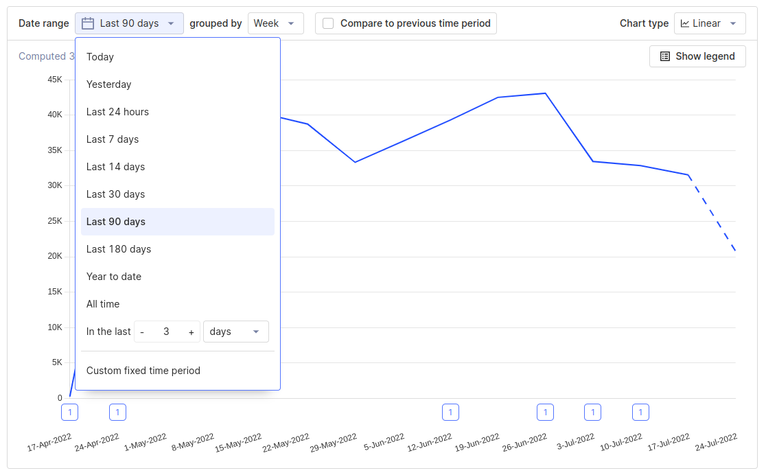
Note: You may see a portion of the chart plotted as a dotted line, which simply means that data for that period is still being collected
Saving and editing a trend
Now that we have our insight set up, the last step is to give it a name and save it so we can view it later! To give this Insight a name, you can click on the pencil icon next to the title, and then click the 'Save' button.
If you ever want to go back and modify a trend, you can do so by clicking on its name in the 'Insight' tab, and then clicking the 'Edit' button in the top right.
Now that you've mastered the basics of the trends insight, we'd encourage you to read through following sections to get a better idea of all the features that trends have to offer.
Filtering events
PostHog offers powerful ways of filtering down events based on their properties. A single filter is composed of three different parts:
The property to filter based on
Example: (Current URL, Browser, etc)
This is the property that we want to filter based on. These properties can be:
- Properties on the event itself
- Properties on the person who sent the event
- Properties on Groups that this event is a member of (See Group analytics)
- Properties on sessions
- Properties on Cohorts the user is a member of
- Properties on the HTML element if an event was autocaptured
By default, the dropdown will only show properties that have been seen on a specific event before, but if you instead want to filter based on an unseen property, you can scroll all the way to the bottom of the list and click 'Show X properties that haven't been seen with this event'
The filter operation
Example: (equals, contains, etc)
This is what PostHog will use to compare the property value to determine whether an event passes the filter or not. Note that the options for this will change based on the type of the property you've selected (e.g. whether a property is a Number or String).
All operations
| Name | Description |
|---|---|
| = equals | The property matches the value exactly and can contain multiple values to match against |
| ≠ doesn't equal | The property doesn't exactly match any of the values you provided |
| ∈ contains | The property contains the value as a substring |
| ∉ doesn't contain | The property doesn't contain the values as a substring |
| ~ matches regex | The property matches a regex (only available for strings) |
| ≁ doesn't match regex | The property doesn't matches a regex (only available for strings) |
| > greater than | The property is greater than a specific value (only available for numeric properties) |
| < less than | The property is less than a specific value (only available for numeric properties) |
| ✓ is set | The property was not set on a specific event |
| ✕ is not set | The property has been set on a specific event |
The comparison value
This is the value that PostHog will compare to the property using the operation you specified. If the operation returns true, then the event will be included in the insight, and if it returns false it will be excluded. Some operations allow you to pass multiple values to compare against, in which case the event will be included if any of these values return true when compared.
Types of filters
Within trends there are two different ways of filtering down events:
Inline filters

These filters apply to a specific series within a graph, and different series can have different inline filters.
Currently, you can only combine inline filters with
ANDoperations. If you want to include events that match at least one of a group of filters, you can use filter groups
Filter groups
Filter groups allow you to apply filters to all series within an insight. These filter groups are composed of a number of single filter, which are can be combined in the following two ways:
AND- Events have to match every filter within the groupOR- Events only have to match a single filter within the group
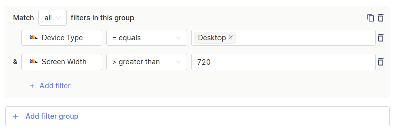
One thing to note about global filters: since they apply to all events within an insight, and these events may not share all their properties, global filters allow you to use any property that has been seen in at least one of your events. If you happen to create a filter that references a property that not all events have, events that do not contain this property will automatically fail the check and will be excluded by the filter.
Filtering internal and test users
The final option for filtering down events is using the option to filter out 'internal and test users'. This option is useful for excluding events sent from local builds of your product, or by members of your team that you don't want to include in your analysis.

If you want to customize the filters that are used, you can click on the settings icon.
Breaking down by properties
Breakdowns offer a way for you to split up your trends graph by the values of a certain property. This is a very powerful tool when analyzing a trend and trying to determine the cause of a change in one of your metrics. Once you've selected a property to break down on, you should see your graph split into multiple lines, each one corresponding to a distinct value of that property.

For readability, PostHog will only load the first 25 values of a breakdown when you first load an insight. You can manually load more values by clicking the 'Load more breakdown values' button.
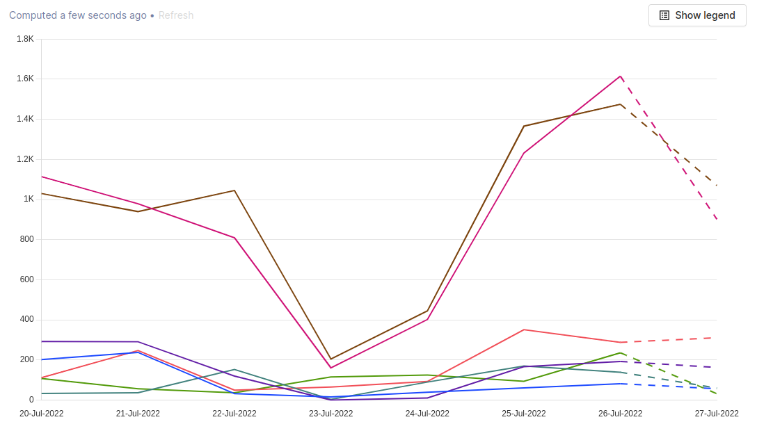
Note: Currently, you're only able to breakdown an insight by a single property, but we're actively working on the ability to breakdown based on more than one property
Viewing totals for each breakdown value
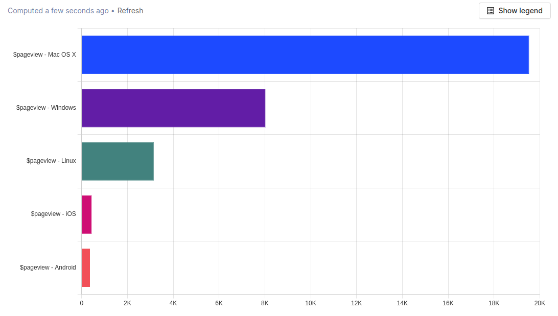
If you're more interested in the total count of an event over a given time period, you can switch to either the Value bar chart or Table view to see the total number of events for each breakdown value.
Breaking down numerical values into bins
When breaking down based on a string value, your graph will be split up with separate series for every distinct value of that property. This works well for text values, however when trying to analyze numeric or time properties, this is often far too granular. As a solution, when breaking down a numeric property, you can select a number of 'Bins' to combine ranges of values into.
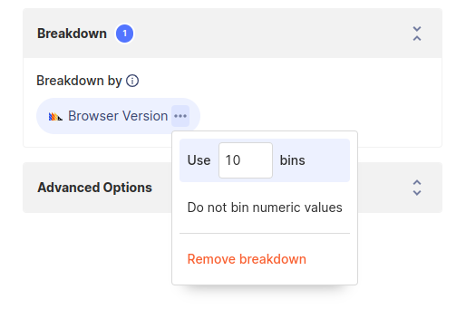
PostHog will then break up your events into the specified number of bins based on the distinct values of the property.
For example, if your property can take the values 20, 21, 22, ..., 40 and you split it up into 10 bins, it will break your events up into ranges of 20 - 22, 22 - 24, etc.
Note that this aggregates all breakdown values, not just the top 25 ones, like it happens for non-numeric values
Viewing individual users and cohorts
When viewing a trend, oftentimes you're interested in drilling down further into users who performed an event on a specific week or day. With trends, this is as easy as clicking on a data point in a plot, which will open up a menu where you can view all the people who performed that event during the time period.
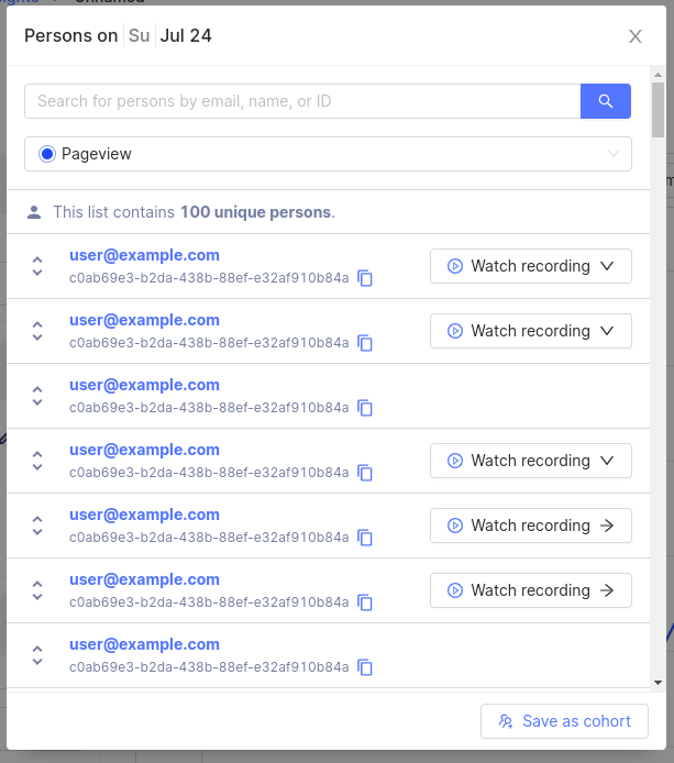
From this menu, you can easily select a user or expand an event to see the properties that were sent, as well as using the 'Watch Recording' button to jump straight to the recording for that user's session.
Using the 'Save as cohort' button in the bottom right, you can also quickly save this group of users to a cohort to perform further analysis.
Event and property aggregation
Trends offer a number of different ways of aggregating events and properties. These options are incredibly powerful, and allow you to answer questions beyond just the total number of events.
Some questions you can answer with aggregation:
- What is the average session duration of users on my site?
- How many unique users have utilized a specified feature within the last month?
- What is the 95th percentile in time spent loading?
Event aggregation
Event aggregation determines how the number of events within a certain period are calculated. In this case, the aggregation is done based on how events are grouped, so if events are grouped by 'Day', then all events on a given day will be aggregated based on the chosen method.
| Event aggregation | Description |
|---|---|
| Total count | The total number of times this event was performed in a given period |
| Unique users | The total number of unique users who have performed this event in a given period. Example: If the same user performs an event twice, this will only count it as 1 |
| Weekly active users (WAU) | The total number of unique users who have performed this event within the last 7 days. This is a rolling count for each period, counting the previous 7 days |
| Monthly active users (MAU) | The total number of unique users who have performed this event within the last 30 days. This is a rolling count for each period, counting the previous 30 days |
| Unique sessions | The total number of unique sessions within the given period where this event was performed |
| Unique groups | The total number of unique groups that performed these events within a period. See this user guide on group analytics for more |
Property value aggregation
Property aggregation is an incredibly powerful part of trends insights which allow you to combine and plot the values of a property. Currently, property aggregation only works on properties with numerical values.
| Property aggregation | Description |
|---|---|
| Average | The average value of a property |
| Sum | The sum of values of a property |
| Minimum | The minimum value of a property |
| Maximum | The maximum value of a property |
| Median | The median of the distribution of property values |
| 90th percentile | The 90th percentile of the distribution of values (90% of events have a property value less than this) |
| 95th percentile | The 95th percentile of the distribution of values (95% of events have a property value less than this) |
| 99th percentile | The 99th percentile of the distribution of values (99% of events have a property value less than this) |
Adding multiple series
Trends support adding multiple series onto the same insight, each tracking a separate event. This is useful when comparing the usages of different events across the same time period.
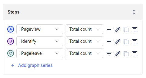
To add a second series to a trend you can click the 'Add graph series' button, and then select the event you would like to plot from the dropdown. Another option is clicking the icon, which will duplicate that series along with its inline filters. This is helpful when you want to compare the same event with slightly different filters.
Changing display options
Within a trends graph, there are a number of different options to tweak exactly how your data appears visually.

Changing the date range
The date range within a trend determines the absolute bounds for which events you want to include in your graph. Trends come with a number of basic time ranges, or you can choose a completely custom range by clicking the 'Custom fixed time period' option.
Changing how values are grouped
Changing the grouping will alter what PostHog considers to be a single 'Data point'. For example, when the grouping is set to 'Week', then each data point on the graph will be one week of events, aggregated using whichever aggregation method you've chosen.
Smoothing
When plotting time-series data, PostHog offers some methods for smoothing out excess variability in data. This is useful for identifying long-term patterns in very noisy data, or in data that fluctuates over a given time frame. In general, the longer time frame that you choose to average over, the more aggressive the smoothing will be. The smoothing operation is done using a moving average over the selected number of days.
Comparing trends to a previous time period
The compare to previous time period option is a toggle that you can activate to overlay the data from a previous period onto the current period. In this case, the 'period' refers to whatever date you've chosen. For example, if you've chosen to view the 'Last 30 days' of events, then turning on this option will display the events from the 30 days before the date range you've chosen (60 days ago to 30 days ago).
Chart types
Trends offer a diverse number of chart types to change how your data is displayed.
Linear
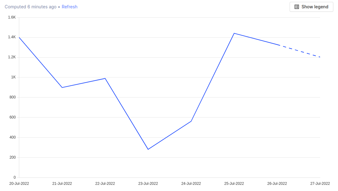
The Linear plot is the most basic type of trend plot and is a simple line-chart with time on the X-axis, and each data point corresponding to the grouping value you've chosen.
Cumulative
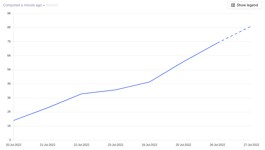
The Cumulative plot displays a running tally of each series over the given interval.
Time (Bar Chart)
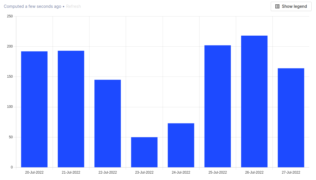
The Time bar chart displays the value of a series over time. This plot shows the exact same information as the linear chart, but in a slightly different visual manner.
Value (Bar Chart)
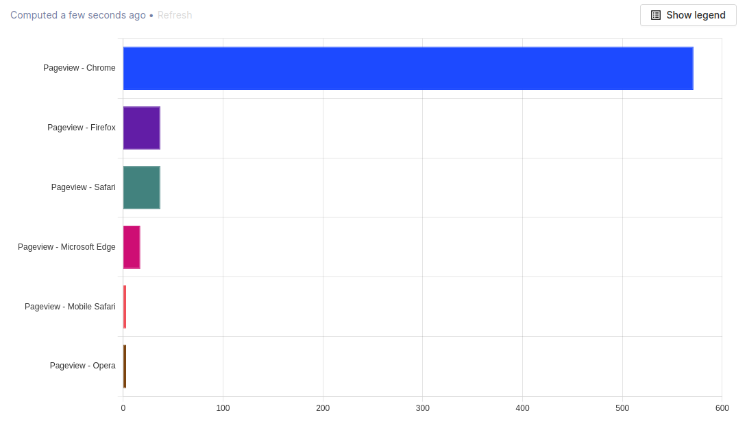
The Value bar chart displays the total value of a series over the entire date range. This means that this type of plot has no option for grouping, as it doesn't display data over time.
Tip: Try using a breakdown in combination with this chart type to see a list of the top property values.
Table
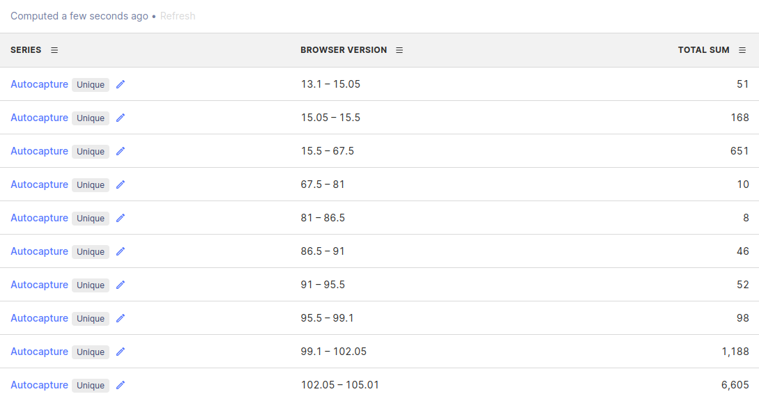
The Table chart displays the raw numerical values of a series over the entire date range. This plot shows the exact same information as the value bar chart, just in a different visual manner.
Pie
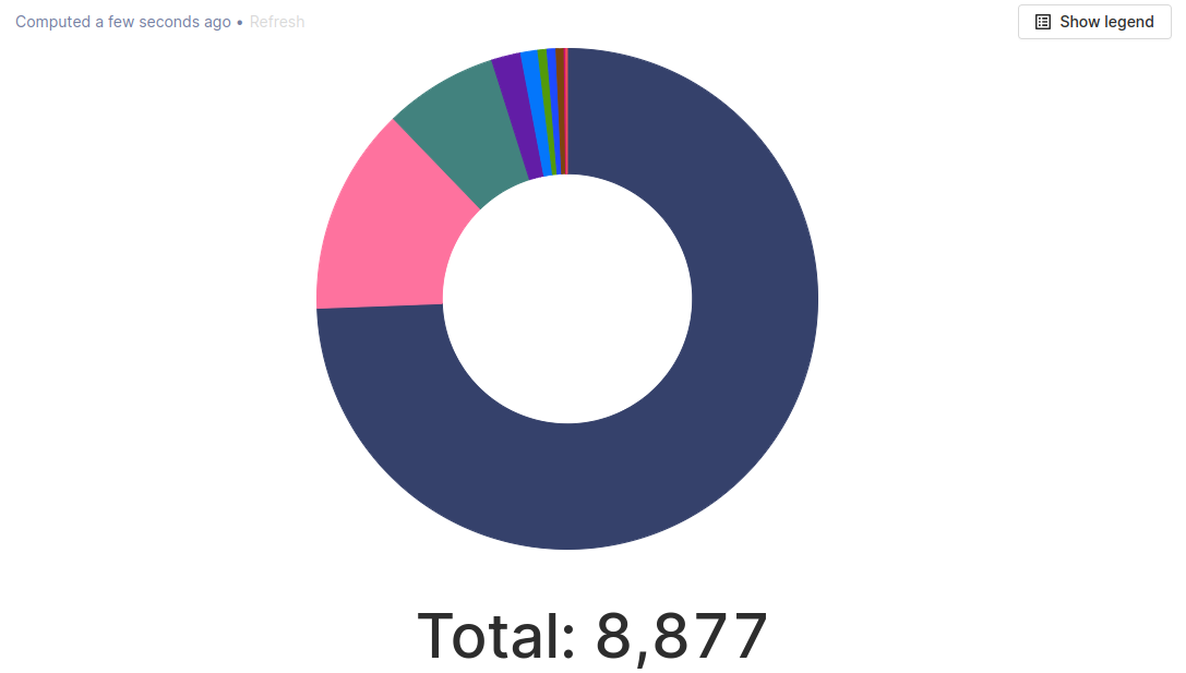
The Pie chart displays the relative distribution of the values of different series or breakdowns over the entire date range.
World Map
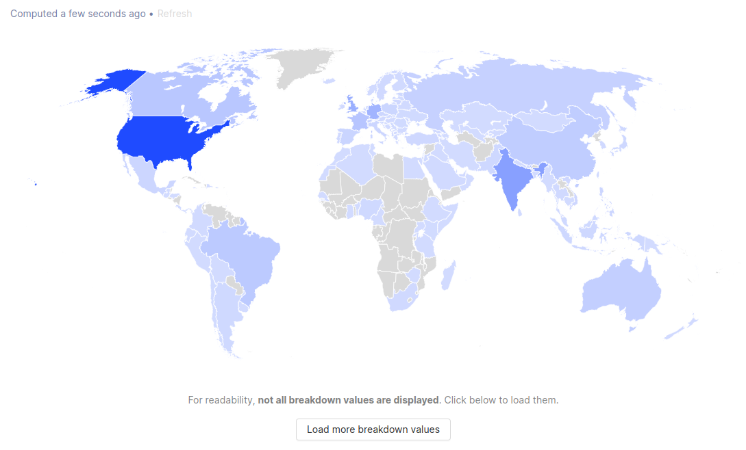
The World Map chart displays values in an interactive map of the world, broken down by country code. This display option can't be selected if you're already breaking down by a property other than Country Code.
Using formulas
One of the most powerful tools when creating a new trend is using custom formulas. Formulas are custom mathematical expressions that you can use to compare and combine the value of multiple series.
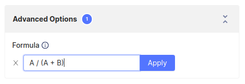
To add a formula, open the 'Advanced Options' dropdown and click the 'Add formula' button. Then within the input box, type out the expression you would like to evaluate.
This expression can contain any number of basic mathematical operators (+, -, *, /) along with variables (A, B, C, ...) which correspond to the series with that letter.
For example, if you have two series A and B, then the formula A / B will plot the value of series A divided by the value of series B at each point in time.
Note: When using a formula, only one series will be displayed on the chart, which will show the output of the formula at each point in time.
View source (Beta)
Insight filters follow a declarative format that you can view and edit. Open the insight editor by clicking on the {} icon next to the save insight button and you will see the source for the current insight configuration. Using this editor you can copy-and-paste complete or partial insights and understand what is going on under the hood. We admit this is a bit of a power user feature, but if you're so inclined you might even find it easier to edit insights this way.

Further reading
Want to know more about what's possible with Trends in PostHog? Try these tutorials:
Want more? Check our full list of PostHog tutorials.